June 28,2022
The Story Behind the Legendary Doomsday Clock and Where It’s Headed
by David Stewart
Despite a global pandemic, economic devastation, and an attack on the U.S. Capitol building, the Doomsday Clock remains at 100 seconds to midnight for the second year in a row.
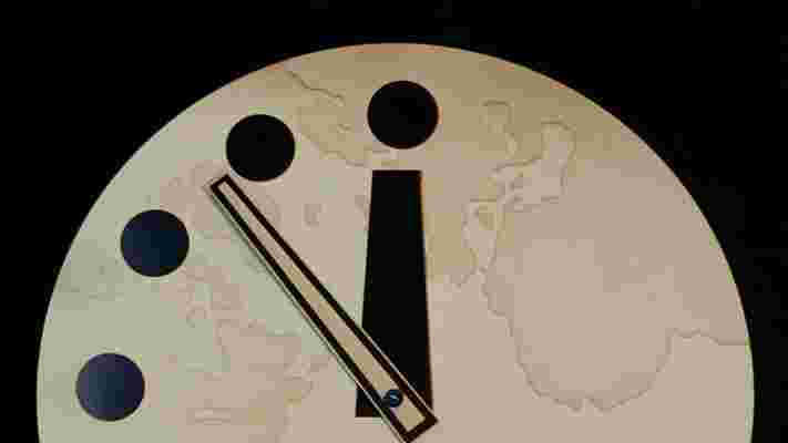
The clock, a metaphor for how close existential threats are to exterminating humanity, was developed in 1947 by the Bulletin of the Atomic Scientists, a nonprofit founded by Manhattan Project scientists following the bombing of Hiroshima and Nagasaki. “The hands of the Doomsday Clock remain at 100 seconds to midnight, as close to midnight as ever,” Bulletin president Rachel Bronson said in a statement on Friday . “The lethal and fear-inspiring COVID-19 pandemic serves as a historic ‘wake-up call,’ a vivid illustration that national governments and international organizations are unprepared to manage the truly civilization-ending threats of nuclear weapons and climate change.”
Originally set at seven minutes to midnight, the clock has shifted numerous times in both directions: The furthest from midnight was 17 minutes , in 1991, following the collapse of the Soviet Union. The current time, equal to one minute and 40 seconds to midnight, is the closest it’s ever been to Armageddon.
The clock itself, which debuted on the cover of the June 1947 issue of the Bulletin journal, was designed by Martyl Langsdorf , a landscape painter and the wife of Manhattan Project researcher Alexander Langsdorf Jr. The artist, who went by the mononym Martyl, set a quarter of a clock face against a bold orange background, with white dots for minutes, a black hour hand, and a white minute hand. “It was the idea of using a clock to signify urgency,” Martyl explained. “My idea was to repeat the clock every month on a different color background…the first color being bright orange to catch the eye.”
Bulletin ’s goal was to educate the public about the imminent threat of nuclear technology, but Martyl admitted she chose the timing—seven minutes to midnight—“simply because it looked good.” The Doomsday Clock graphic was the only magazine cover designed by Martyl, who primarily painted abstract landscapes and murals. The Langsdorfs lived in Chicago at the time, and she was part of the city’s art scene, counting curators, artists, and critics among her social circle. As Charlotte Hecht argues in Art & Object , the design of the clock was steeped in the “crosscurrents of modernism, industry, and science that ran through the city at mid-century.” The flat geometric shapes and simplicity of line and color that Martyl employed are hallmarks of the midcentury-modern style, popularized during the 1930s and ’40s in the United States by an influx of European émigré designers—Bauhauslers such as Laszlo Moholy-Nagy, founder of the “New Bauhaus” in Chicago in 1937.
It was two years after the clock’s debut, when the Soviet Union tested its first nuclear weapon, that Bulletin first moved the clock’s hands—pushing it four minutes closer to midnight and inaugurating it as a barometer for humanity’s proximity to oblivion.
The clock is Bulletin ’s official logo and has appeared on every cover of the journal until it ceased print publication in 2008. It has also found its way into the broader landscape of pop culture, referenced by everyone from Iron Maiden to Linkin Park , and in numerous films, books, and TV shows. Alan Moore incorporated the Doomsday Clock in his seminal 1986 comic book Watchmen and it was the name given to the series’ 2017 sequel.
“It’s such an intuitively tension-building image,” graphic designer Michael Bierut, who updated the clock design in 2007, told The Washington Post after Martyl’s death. “To be able to reduce something that complex to something so simple and memorable is really a feat of magic.” Bierut, who later designed the logo for Hillary Clinton’s 2016 presidential campaign, called the Doomsday Clock creation “the most powerful piece of information design of the 20th century” in his 2015 book How To. “Arguments about nuclear proliferation have been complicated and contentious. The Doomsday Clock translates them into a brutally simple visual analogy, merging the looming approach of midnight with the drama of a ticking time bomb,” he says in the book.